Graphic Design Resume Tips to Get You Hired in 2022
Now is a great time to be a designer. The job market is booming, and there are lots of great options for talented individuals. However, there is a lot of competition, too, so you need an excellent graphic design resume to stand out from the crowd.
If you’re applying for design positions, you’ll need two things:
- a designer resume
- a design portfolio
In this guide, we’ll show you how to write a graphic designer resume and provide tips on creating your portfolio too.
How to format a graphic design resume?
You have a few choices here.
You can download a designer resume template and plug in your details. There are lots of templates available in word processors like Word or Google Docs, or you can find them all over the Internet.
The benefit here is that all the formatting is taken care of. Your resume will look professional and be easy to read.
The downside is that your designer CV might not stand out.
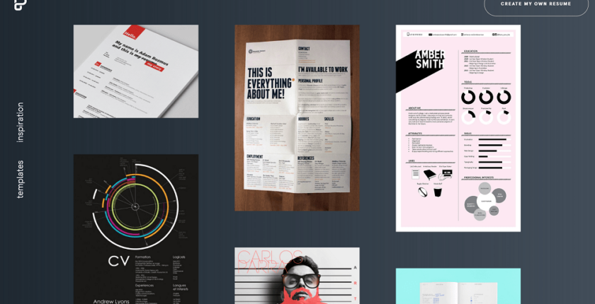
As a designer, you might be tempted to make a super fancy designer CV to show the hiring manager that you’ve got what it takes. In fact, many designers create their own resumes using the tools they use day to day.
Some of these designs are refreshing and fun, like this one by Resume Angels.
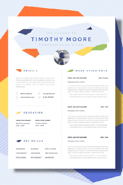
However, keeping your resume simple and easy to read is important. So don’t go overboard.
A study from a few years ago suggests that resumes with “fancy” formatting get rejected 41% of the time, compared with formally formatted resumes (26%).
Additionally, a more recent study suggests that elaborate formatting is a deal-breaker for about 1 in 4 hiring managers.
So that’s the tightrope you need to walk. Yes, a designer resume doesn’t need to be as formal as a corporate banking CV, but if you take it too far, you could risk being thrown on the scrap heap.
Here are a few formatting tips to keep your resume readable.
1. Use two fonts at most
Keep fonts consistent and use two at most in your resume. E.g. One font for headings, one for text.
2. Size matters
A good general rule is to keep your:
- main text between 10pt and 12pt
- headings around 14pt
- your name a little bigger at 16pt.
3. Keep it to one page
Try and keep all your info on one page. Make cuts if you need to. Don’t shrink the writing or open the margins to fit everything in. It won’t fool anyone.
4. Keep colours to a minimum
Not all designers will agree with this advice, but you should keep colours simple. Black writing against a white page is easy to read. Some hiring managers print out CVs and read them by hand. The wrong colour scheme could be hard to read and might end up in the reject pile.
5. Send it as a PDF
Unless you’ve gotten instructions that tell you otherwise, send your designer resume as a PDF. This way, it will look the same on all devices.
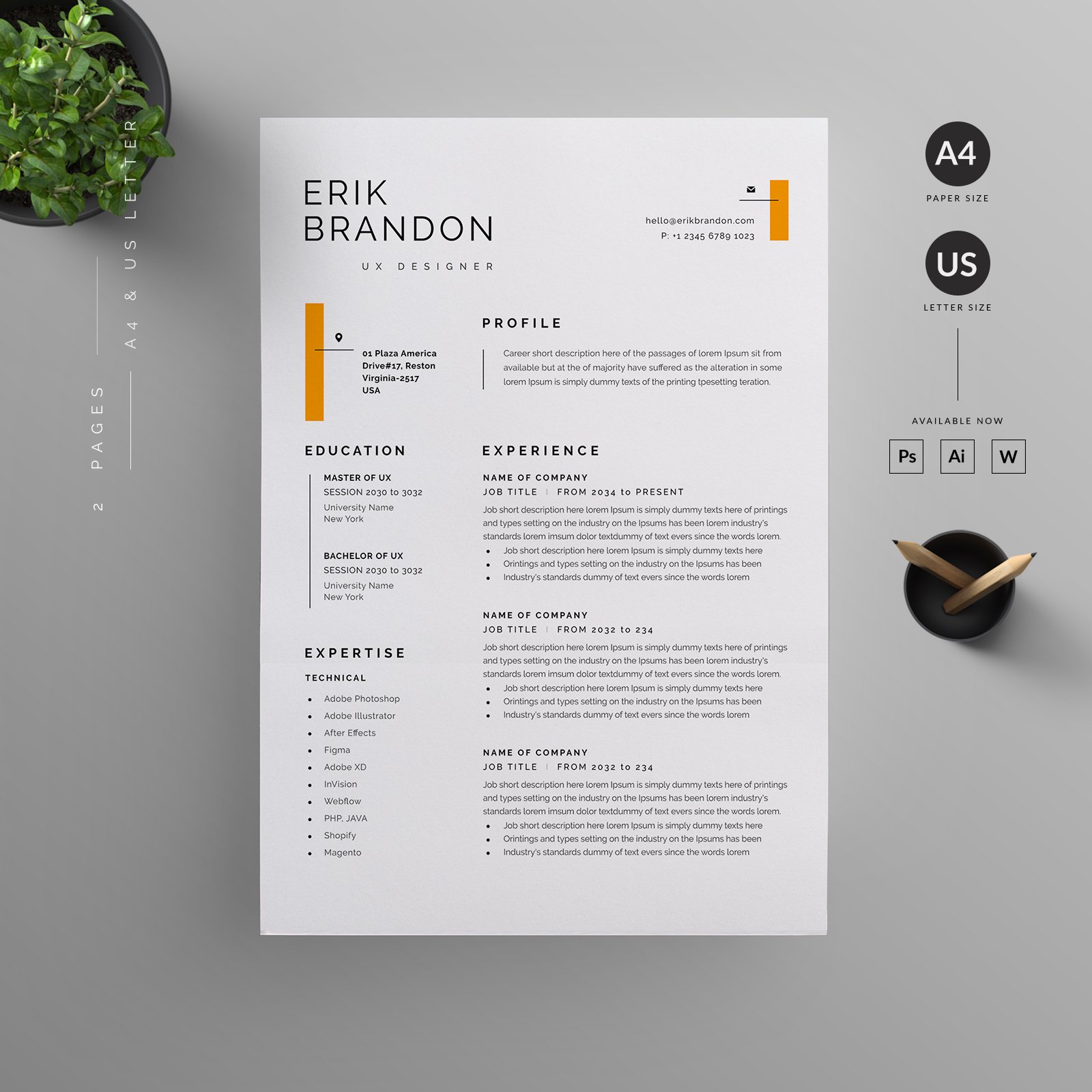
Here’s an example of a good clean CV that has some interesting design elements but never at the cost of readability.
How to write a graphic design resume that makes an impact?
There was an eye-tracking study done a few years ago that suggested that hiring managers only take around 7.4 seconds to evaluate a resume. That’s not a lot of time for you to impress.
Additionally, most firms use an Applicant Tracking System (ATS). These automated tools scan your resume for keywords and sift out the best candidates.
Using an overly complicated font or design can actually hinder the ATS, which will lead to your resume being rejected.
So these are the first barriers that you need to consider when you are writing a designer CV.
OK, so let’s have a look at the sections you need to include on your designer resume.
1. Contact details
The first section of your designer resume should include your contact details.
You should list:
- Your name
- Address
- Contact number
- Email address
- Portfolio
Something like this will work.

2. Summary
Remember we told you that hiring managers just scan resumes for a few seconds? Well, why not make their job a little easier by adding a resume summary?
A resume summary is a brief overview of your work experience, education, skills, and achievements. It’s a short paragraph that summarises your CV.
You should include this section right after your contact details — as shown in the graphic above. Keep it tight and punchy, and only list your most impressive information.
3. Work Experience
Listing your contact details and summary first is the best way to make an instant impression. How you list the following sections depends on a few different things.
Let’s say you’re a recent graduate. You might not have a lot of work experience. So leading with your work experience section won’t be the best idea.
Of course, if you’ve been in the trenches for the last few years, you’ll want to make it clear to the hiring manager that you have a good working background.
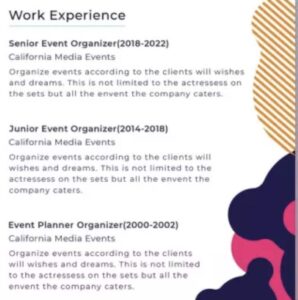
You should format your Work Experience section like this.
- Your role
- Company name
- Location
- Dates worked
- Bullet point list of duties and responsibilities.
Your Work Experience section is your chance to really impress the hiring manager. It’s a place to show why you’re a valuable employee and what you can bring to the job.
When you are listing your work experience, use active verbs. These kinds of words give your sentences more power and punch.
Additionally, try to quantify your achievements. For example, instead of writing that you’ve improved onboarding on an app, say something like, “boosted onboarding of X banking app by 200%”. It sounds more impressive.
4. Education
If you are short of work experience, your education section will be more important. In fact, if you’ve just graduated, there is a strong argument for including this section first.
Use your best judgement here. If you have a lot of experience, you can keep your education section really brief and just include:
- Educational institution
- Qualification
- Course name
- Year graduated
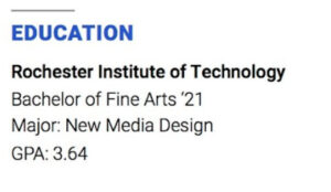
If you don’t have work experience, but your education has prepared you for the job, lists course work, projects, achievements, or anything else that makes you seem like a good candidate.
5. Skills
Your skills section for a graphic designer resume / CV should be fairly straightforward. It’s good to go for a mix of both hard and soft skills.
Hard skills are things that you learn—for example, design techniques, software, coding languages, etc.
Soft skills are things like teamwork, time management, leadership, etc.
So include a mix of the two in short bullet points.
One design flourish that we’ve seen on designer resumes is little grading systems to show how proficient you are at each skill. See an example below.
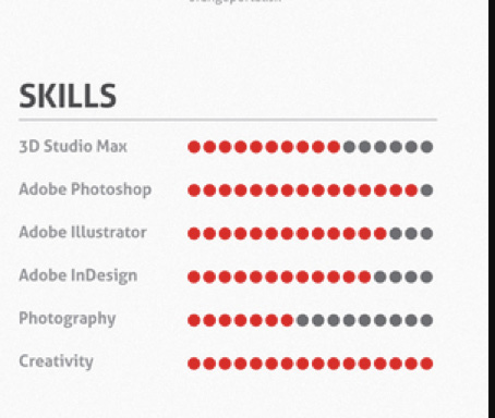
This feature is a good example of how a little visual design improves a resume and makes it easier to read. But there’s nothing wrong with making it simple, like the example below.

6. Additional sections
Adding additional sections to your graphic design resume can help. A good general rule is to try to keep your resume to one PDF. Keeping things simple is the right approach. However, if it adds enough value, you can add additional sections like:
- Interests & hobbies
- Awards
- Certifications
- Publications
Before you add any sections, ask yourself whether these details show that you are a good designer. If they are irrelevant to your designer role, leave them out.
Of course, there are some situations where your achievements will demonstrate leadership, initiative, good communication or teamwork. Depending on the role, these can be excellent qualities to document. So even if they are tangential, you can use them.
7. Customise your graphic design resume
A lot of designers think that they should create their resume and then just send it off to each job they see. This approach is doomed to fail. You should always customise your CV for each position.
For example, if you see a job description for a designer role, the best thing you can do is study it carefully. Note down the responsibilities. Is the firm looking for someone who can code in a specific language? Do they want product designers who have extensive experience with user research? Does the position involve making wireframes or MVPs?
Hiring managers typically have an idea of what their ideal hire looks like. So study the job description carefully and note everything down.
Then, look through your own work experience. What things have you done that make you a good candidate for this particular job? Write them down and work them into your resume summary, work experience section, and possibly your education if you need to.
Tailoring your designer CV for each position is crucial for two reasons:
- The hiring manager will know you have the experience, skills, and education for the job.
- The ATS could be set up to look for specific keywords and exclude resumes where they are absent.
Obviously, we aren’t saying to be dishonest. If you don’t have experience with something, don’t pretend you do. You’ll be found out if you get the job. But do emphasise your relevant skills and experiences.
This approach could mean taking out some chunks of your resume and replacing them with a new set of achievements and skills. It’s worth it, because these edits will keep your resume lean and give you a better chance of getting an interview.
8. Your designer portfolio
Design jobs are fairly different to other positions. For starters, hiring managers are more concerned with what you can do rather than your education. While this won’t be true for all organisations, there are many designers that get jobs based on their portfolio alone.
So, it’s fair to say that a designer portfolio is one of the most important aspects of a designer’s resume.
You can adopt some of the same principles outlined above when putting your portfolio together. For example, you could have amazing animation or graphic design work in your portfolio, but if you’re applying for a UX designer position, they won’t be as relevant.
It’s best to show work directly related to the job you are applying for.
What to do if you’re just starting out and don’t have a portfolio?
If you’re new to the design world and you don’t have a portfolio, it can seem like a catch-22 situation. You can’t get a job without experience, but you can’t get experience without a job.
But remember, nothing is stopping you from making a portfolio that demonstrates your skills, even if the work you include is not for paying clients. So, get out there and do great work, and you’ll get opportunities.
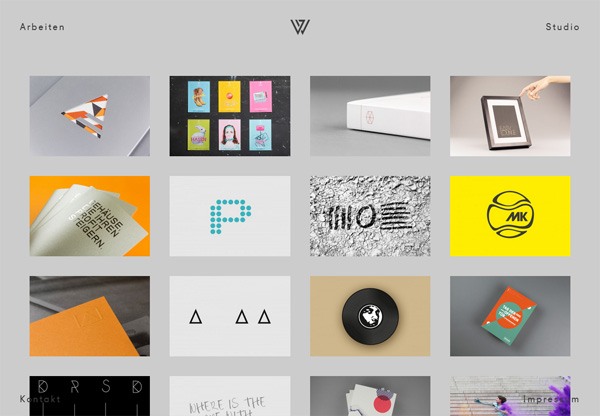
Design portfolio by Julian Weidenthaler
Tips for your designer portfolio.
1. Tell a story
Finished work is an excellent part of your portfolio. But ensure that you show your process too. A detailed case study should show:
- What you set out to design
- What problems you faced
- How you solved those issues
- How you built the final product
2. Keep it focused
Yeah, maybe you’re a great all-rounder. But if the job description isn’t calling for an illustrator or logo designer, don’t shove it into your portfolio. Keep it relevant and focused.
3. Pick a great portfolio host
Some designer resumes include their portfolio alongside their PDF CV. However, there are lots of great designer portfolio hosting websites available. But remember, hiring managers want instant results, so if you link to your portfolio, make sure you have a killer landing page.
Conclusion
Writing a great designer resume is all about making your experiences and qualifications very clear. You need to make sure that the hiring manager can easily digest your information so they know you are a good candidate for the position.
Always customise your designer CV for each individual job. It will boost your chances of getting an interview. Additionally, keep the formatting simple and legible. Include a portfolio of your work when you want to show your design chops, and be careful about over-engineering your resume, because research suggests it might get thrown into the rejected pile.
Cover pic by Piktochart

